
Logos
The Peacehaven logo is the cornerstone of our organization’s visual identity. In order to ensure brand integrity and strength, consistent use of the logo is essential on all materials representing the organization.
Concept
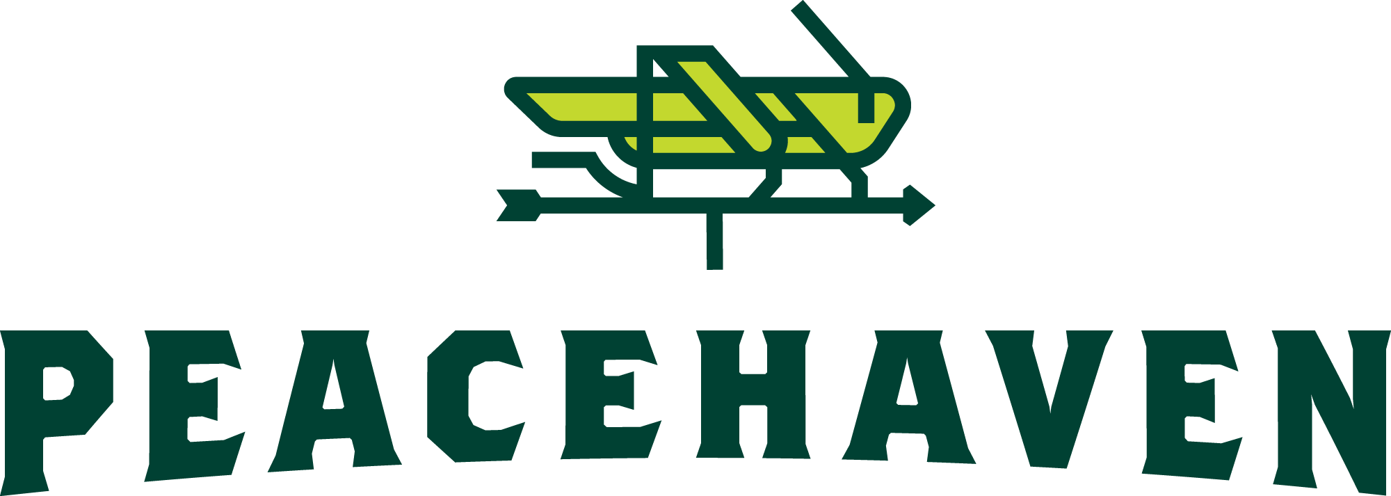
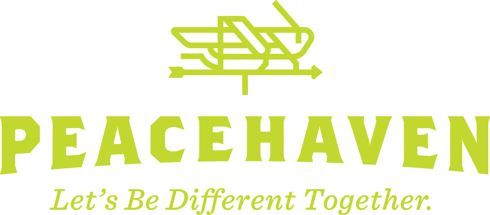
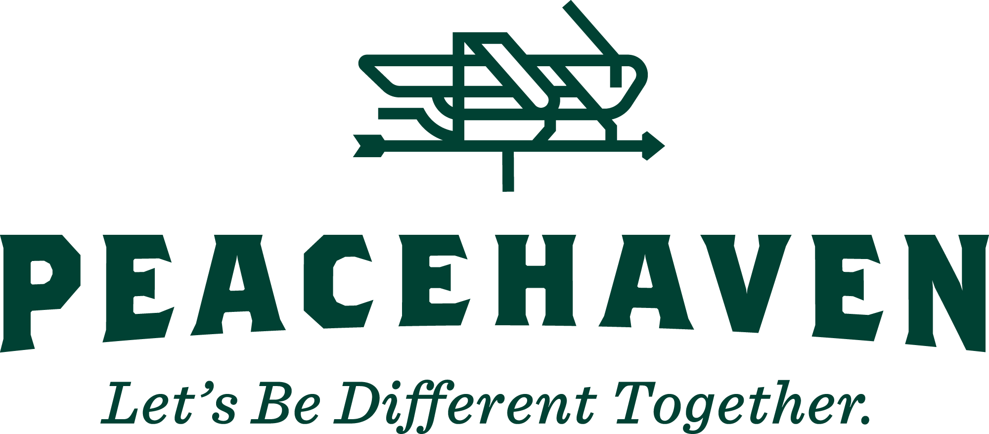
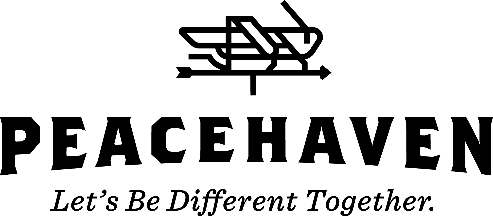
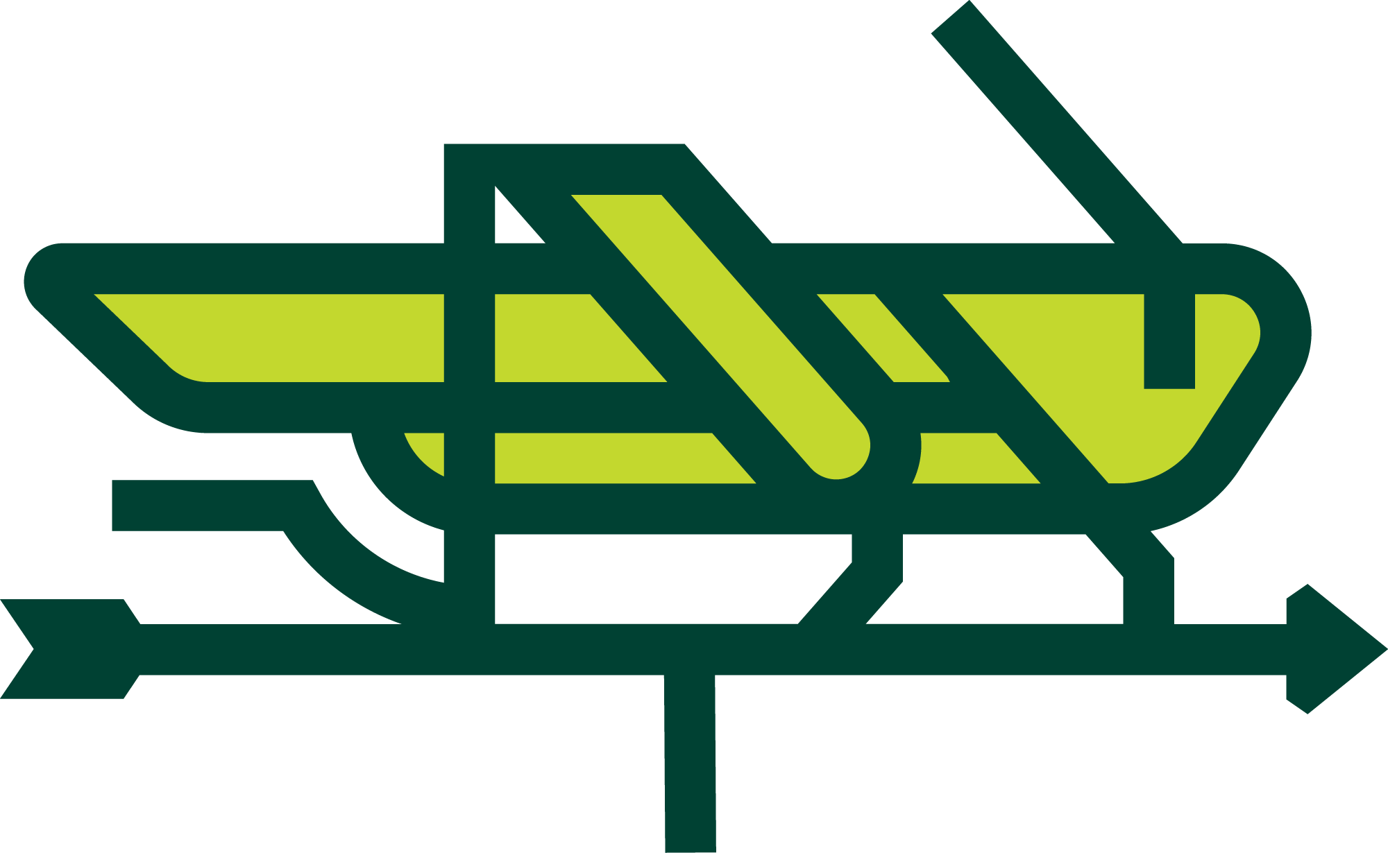
A longtime symbol of Peacehaven, the grasshopper mark represents our liveliness, potential for growth, and our connection to nature. Similar to the outsized potential of our community, a grasshopper can jump more than 20 times its own length, a poignant reminder that our differences are power, and our challenges are opportunity. The vane on which the grasshopper sits grounds the mark in a usable way, but also connotes shared direction and movement, guided by the forces of nature and of community that shape our vision.
The typography and treatment of the organization’s name strikes a wholesome, friendly tone, while gently referencing found typography on the farm crates and tractors of old. The subtle arc in the Peacehaven text is inspired by the rolling landscape of the farm itself. The risk to explore the next horizon motivates the work of Peacehaven, daily.
Color Variations
Different applications will require a variety of color combinations for the logo, but to maintain readability, not any combination can be used.
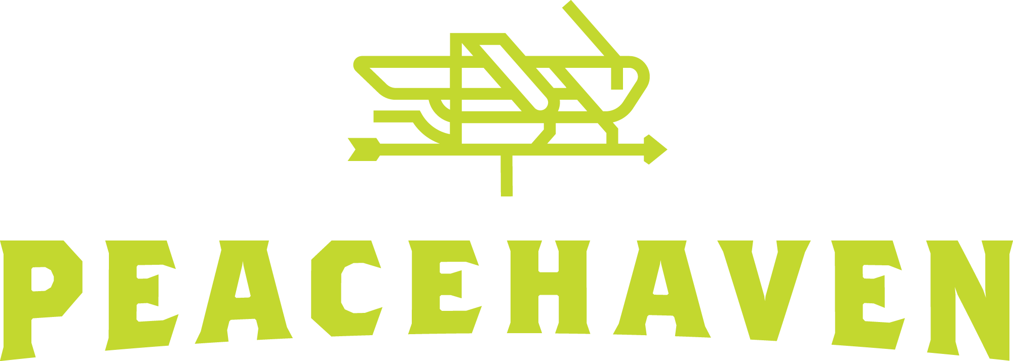
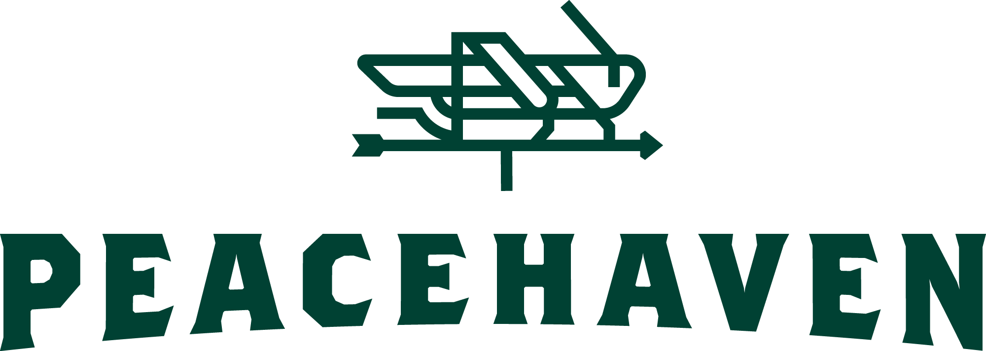
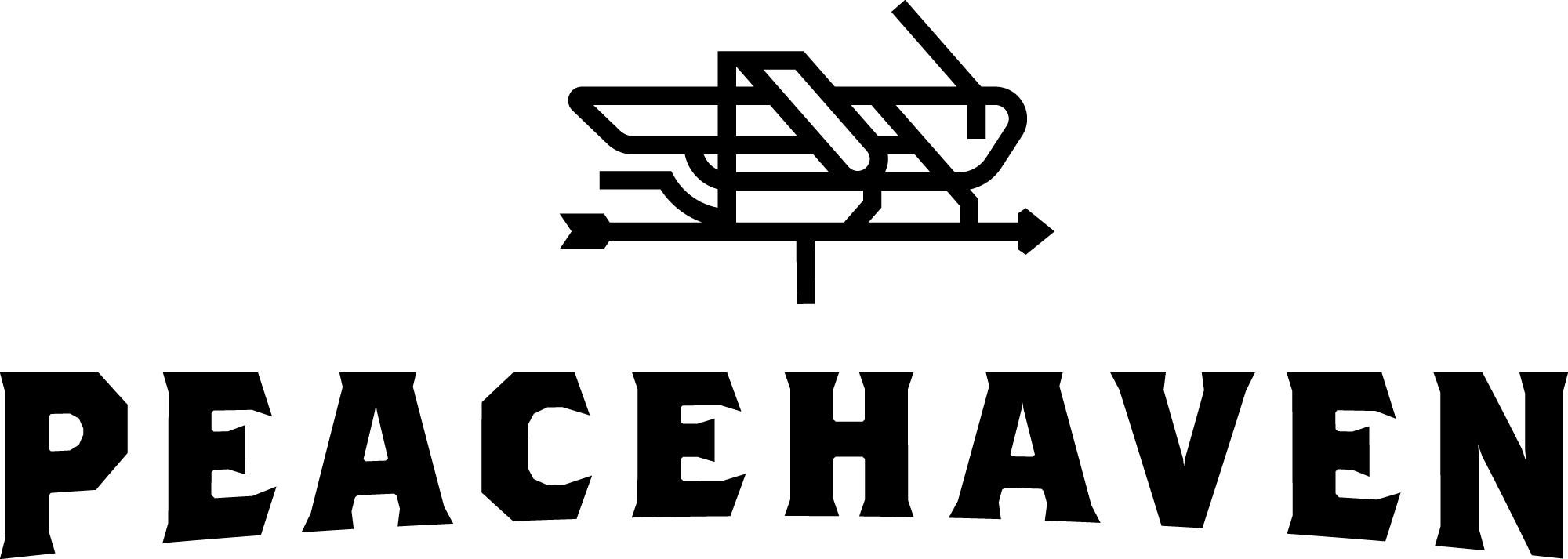
There are two versions of the logo: positive and negative. The positive version should be used when the background color is lighter than the typography, the negative version when the background is darker.
When appearing on a solid color, be sure there is sufficient contrast between all colors of the logo and background. When used on a colored background, it is preferred the logo appear on the Peacehaven dark green when possible, as shown here.
download full color logo

download light green logo
The primary colors of the farm’s logo are dark green and light green. As such, the logo should never be presented in other colors unless production constraints dictate printing a spot color, or printing in black in white. In such cases, the logo should be printed in dark green, black, or white. If possible, the color version of the logo should be used in digital applications or in four-color printing.

download dark green logo

download white logo

download black logo
Logo and Tagline
Our tagline, “Let’s be different together” has been carefully crafted to communicate the heart of what we do, clarifying our organization's name and connecting it to our mission, vision, and values. The tagline should be used mostly with uninitiated audiences who may not be familiar with Peacehaven, or in situations where there is little explanation about our organization.
For example, when our logo is used alongside others for an event we’re sponsoring, or on premium products such as apparel, mugs, etc.
It should only be used when the tagline is large enough to read—the logo should be no smaller than 1.5" at its widest point.

download positive logo + Tag

download light green logo + tag

download dark green logo + Tag

download white logo + Tag

download black logo + Tag
Using the Grasshopper Mark Alone
The grasshopper mark may be used without the “Peacehaven” type as long as it appears in close proximity to the organization name.
For example, the grasshopper mark could be used as a social media profile image or on collateral pieces, assuming “Peacehaven” is clearly stated in the same context. The grasshopper mark should never be used as a pattern or in combination with another symbol to create a new logo.
If you have questions about whether your application is acceptable, please contact the Director of Communications & Marketing.

download positive mark

download negative mark
Clearspace
Effort should be taken to not crowd the logo when used in conjunction with other design elements. As a general rule, a margin equal to the height of the “N” should be left on all sides of the logo.
Logo Misuse
In order to maintain the design integrity of the brand, the following examples show common misuses of the logo that should be avoided when designing materials for Peacehaven.

Always maintain the original proportions of the logo. Do not stretch or skew the logo.

The logo should always appear square to the edge of the page or screen. Do not rotate the logo.
High-resolution or vector art files should always be used in brand materials. The logo should never appear pixelated or blurry when printed.

Colors need to be consistent across all brand materials. Do not use colors that are not part of the brand color palette with the logo.
Enhance readability by using sufficiently contrasting background colors. Do not use backgrounds colors that are very close in value to the logo colors.
Make sure the logo reads well on whatever background you use. Avoid using the logo on photographs that make the logo difficult to read.

Do not add holding shapes around the logo or graphic elements behind the logo.

Do not apply effects such as shadows, embosses, or bevels to the logo.
Image File Types & Color Space
The logos above are provided in four files types:
- PNG files are what you will use most, and are the best format for Microsoft Word, Powerpoint, Google Docs, etc. PNG files are in RGB color space and are intended for onscreen use. They have transparent backgrounds for use on colors other than white.
- EPS files should be used for professional print production: apparel, mugs, signage, professionally-printed publications, etc. EPS files above are in CMYK color space intended for printing.
- SVG files are for use on professionally-designed websites. SVG files are in RGB color space and are intended for onscreen use. They have transparent backgrounds for use on colors other than white.
- We’ve included JPGs because they are most familiar, but generally PNG files work better in any application you use JPGs. JPGs do not have transparent backgrounds and should not be used on colored backgrounds.